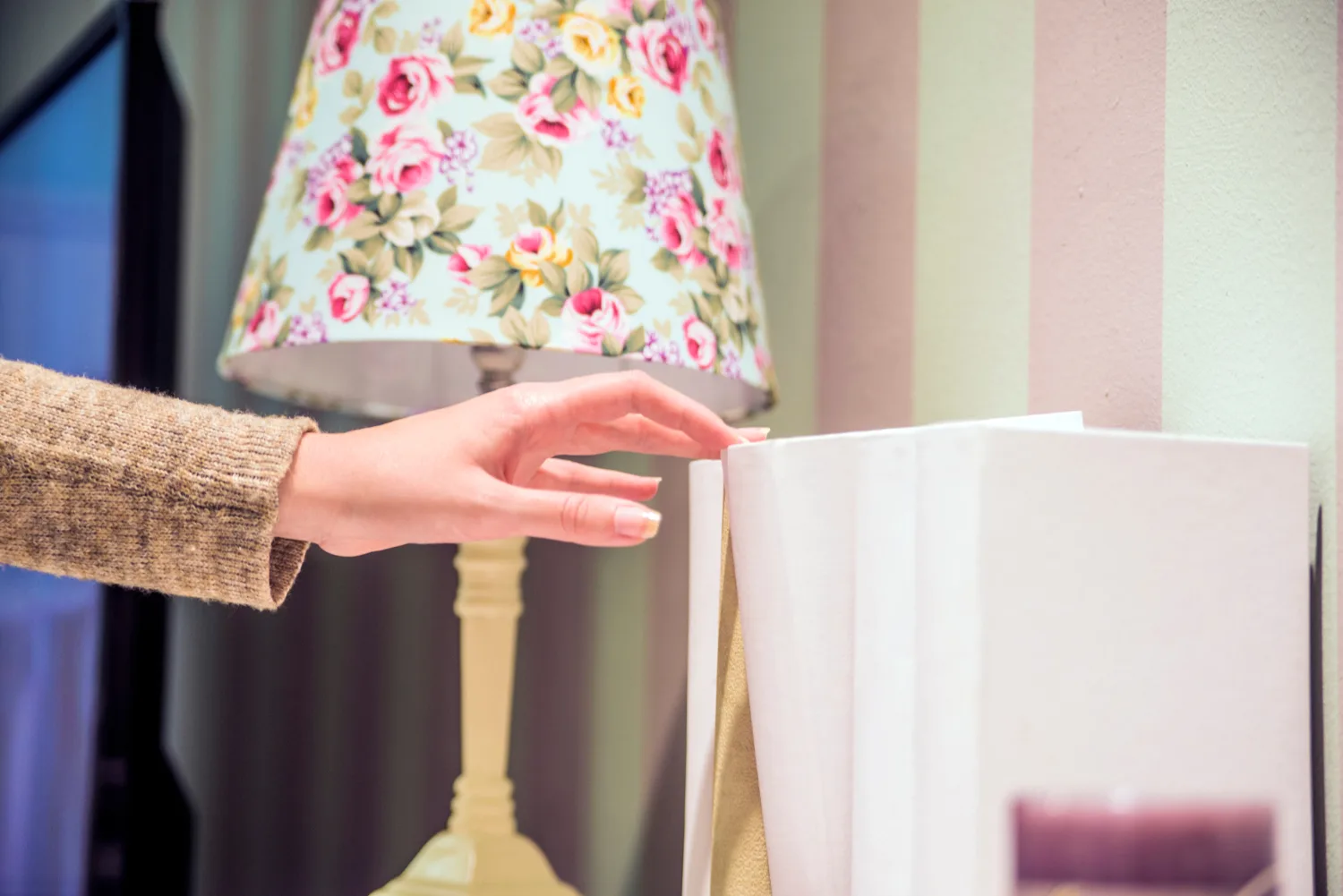
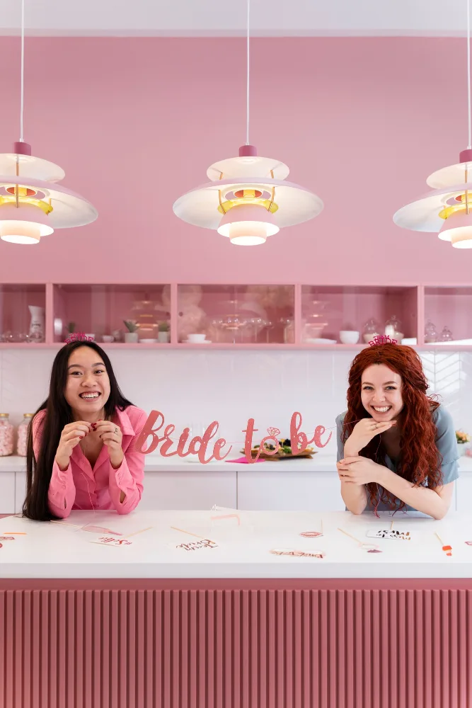
When customers walk into a retail space, the first thing they notice isn't the products on the shelves-it's the color that surrounds them. The walls, ceilings, and accent features create an immediate emotional response that shapes their entire shopping experience. This is where commercial painting trends intersect with color psychology, a powerful tool that savvy retailers are using to influence customer behavior, mood, and purchasing decisions.
Understanding Color Psychology in Retail
Color psychology is the study of how different hues affect human emotions, behaviors, and perceptions. In retail environments, colors do far more than create visual appeal-they communicate brand identity, guide customer movement, and subtly encourage spending.
Research shows that 90% of snap judgments about products are based on color alone. For retail spaces, this means that the strategic use of paint colors can literally influence whether customers linger, engage with products, or make purchases. Each color carries psychological weight, and understanding these associations is essential for creating an effective retail environment.

Trending Colors for Modern Retail Spaces
Warm Neutrals and Terracotta
The move away from stark whites and grays continues in 2025. Warm neutrals including creamy beiges, soft taupes, and earthy terracottas create an inviting, approachable atmosphere that makes customers feel comfortable spending time in a space. These colors work particularly well for luxury brands and boutique retailers, as they convey sophistication without coldness.
- __________ Creamy Beige
- __________ Soft Taupe
- __________ Earthy Terracotta
Deep Jewel Tones
Emerald green, sapphire blue, and rich burgundy are gaining traction in high-end retail. These saturated colors create a sense of exclusivity and luxury. They're particularly effective in accent walls or feature areas, as they draw attention without overwhelming the space. Jewel tones convey quality and can increase perceived value of products.
- __________ Emerald Green
- __________ Sapphire Blue
- __________ Rich Burgundy
Soft Pastels and Millennial Pink

Pastel Colors Psychology for Retail Envirinments
The popularity of gentle, muted pastels persists, especially in fashion and lifestyle retail. Soft pink, lavender, and pale sage create a calming, aspirational environment that appeals to younger demographics. These colors reduce customer anxiety and create an Instagram-worthy aesthetic that encourages social sharing.
- __________ Soft Pink
- __________ Lavender
- __________ Pale Sage
Moody Charcoals and Deep Grays
For tech companies, premium brands, and contemporary retailers, deep charcoal and sophisticated grays remain popular. These colors convey professionalism, modernity, and exclusivity. When paired with bright accent colors or natural light, they create dramatic, memorable spaces.
- __________ Deep Charcoal
- __________ Sophisticated Slate Gray
Strategic Color Placement in Retail Design
Beyond choosing the right colors, strategic placement maximizes their psychological impact:
Entry Points and Feature Walls
Use energizing or welcoming colors like warm coral, inviting blues, or fresh greens to draw customers in and set the tone. These high-impact colors create memorable first impressions without overwhelming the entire space.
Main Shopping Areas
Benefit from neutral or slightly warm backgrounds that don't compete with products. These allow merchandise to be the star while maintaining a pleasant, browsable environment. Soft whites, warm grays, and gentle beiges are ideal here.
High-Value Product Zones
Can feature deeper or more saturated colors to draw attention and convey premium positioning. A jewel-tone accent wall behind luxury items naturally directs customer focus and suggests exclusivity.
Transition Spaces and Dressing Rooms
Work well with calming colors like soft blues, pale greens, or gentle purples. These colors reduce customer anxiety and create a positive emotional state that supports purchasing decisions.
The Psychology Behind Specific Colors
Red
Stimulates appetite and urgency, making it ideal for food retail and limited-time promotions. It increases heart rate and can encourage quick decisions.
Blue
Conveys trust, calm, and stability - perfect for pharmacies, tech stores, and corporate retail environments. It's also associated with lower prices, making it effective for discount retailers.
Green
Suggests health, growth, and sustainability. It's increasingly popular in wellness, organic, and eco-conscious retail spaces.
Yellow
Evokes optimism and energy but can feel overwhelming in large doses. It's best used as an accent to draw attention to specific areas or products.
Purple
Conveys luxury, creativity, and imagination. It's effective in high-end fashion, beauty, and specialty retail.
Black and Deep Grays
Communicate sophistication, formality, and premium quality. They're excellent for luxury brands and upscale retail environments.
Industry-Specific Applications
- Fashion Retailers are moving toward neutral backdrops with bold accent walls, allowing clothing to be the focal point while creating visual interest.
- Beauty and Cosmetics Brands increasingly use jewel tones and metallics to convey luxury.
- Grocery and Convenience Stores stick with warm, energizing colors to encourage browsing and impulse purchases.
- Wellness and Spa Retailers favor calming pastels and natural earth tones to support relaxation and healing.
Practical Considerations for Commercial Painters
When implementing these color psychology principles, professional commercial painters should consider several factors:
- Ceiling Height: Darker colors make high ceilings feel cozier, lighter colors make low ceilings feel more open.
- Natural and Artificial Lighting: Colors appear different under various light temperatures.
- Maintenance: Matte finishes show dirt but hide imperfections, while glossy finishes are easier to clean but highlight irregularities.
Conclusion
The intersection of commercial painting trends and color psychology represents a sophisticated approach to retail design. By understanding how colors influence emotions and behavior, retailers can create spaces that are not only beautiful but also strategically optimized to enhance the customer experience and drive business results. Whether you're refreshing an existing retail space or designing a new one, choosing the right paint colors is an investment in customer satisfaction and sales performance.
The bottom line? Your retail space is never just a neutral backdrop - it's a powerful tool for shaping how customers feel, what they notice, and ultimately, what they buy.
Ready to Transform Your Retail Space with Strategic Color Psychology?
Don't let your retail environment blend into the background. Whether you're looking to refresh your current space or create a brand new customer experience, our team of professional commercial painters understands the science of color psychology and how to apply it to your unique retail needs. We'll work with you to select the perfect color palette, ensure flawless application, and deliver results that not only look stunning but also drive measurable business outcomes.
Contact us today for a free consultation and quote. Let's discuss how strategic paint colors can transform your retail environment, enhance customer satisfaction, and increase your bottom line. Our experts are ready to help you create a space that customers won't forget.
